

Creating an Angular Material YearPicker component out of an customized DatePicker component
Using Angular Material with Angular


Hi again!
Based on an Stackoverflow question (post on Stackoverflow) where they were looking for an YearPicker-component which is according to the post not supported by Angular Material. But in my opinion it is. And in this article I wanna show you how you can simply tweak the existing Angular Material DatePicker component to get a YearPicker component.
Used libraries:
Angular Version > 13
Angular Material (based on the MomentJS date implementation, but it works with every other implementation as well)
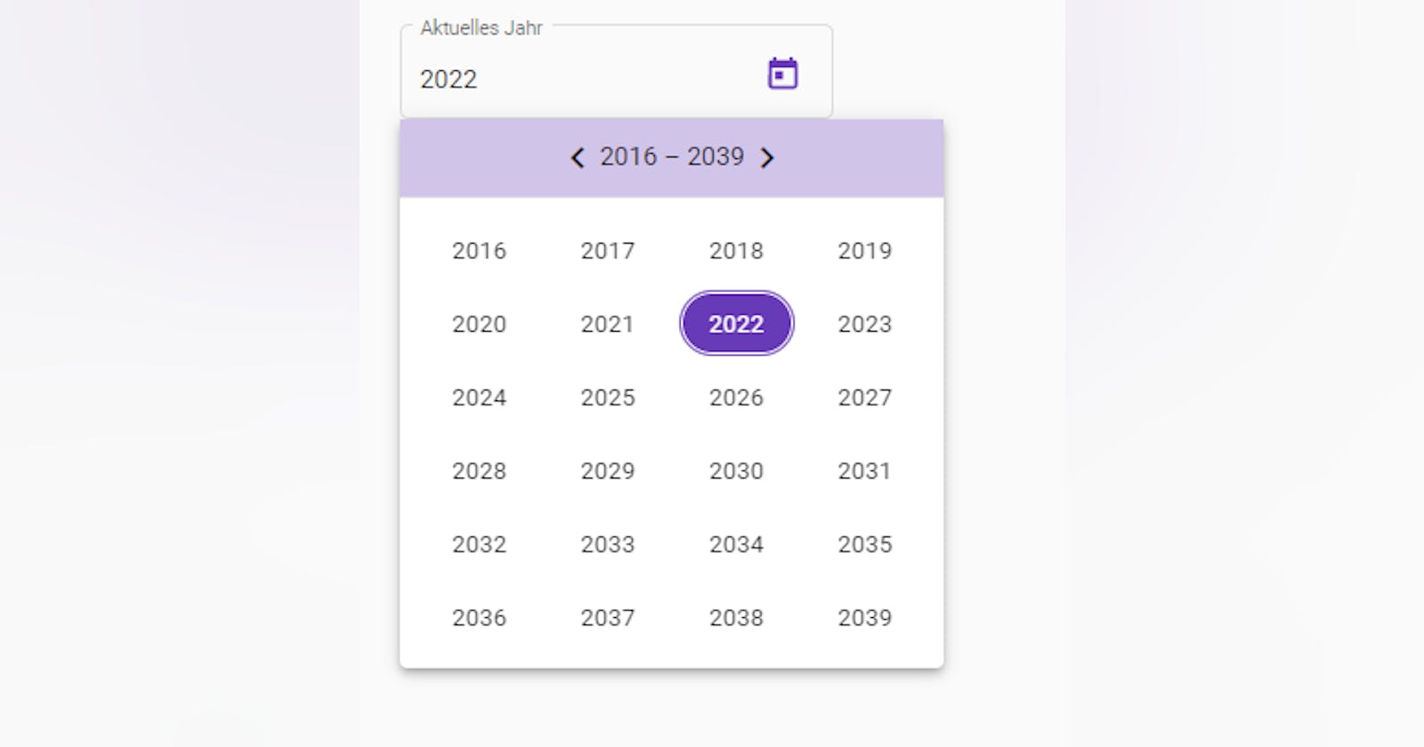
The result looks like the following picture:
Step 1:
Create a Angular component like ng g c components/yearPicker.
Step 2:
Add following html to the html-template of the YearPicker component:
<mat-form-field appearance="outline">
  <mat-label>Aktuelles Jahr</mat-label>
  <input matInput [matDatepicker]="picker" readonly [value]="selectedYearISOFormat">
  <mat-datepicker-toggle matSuffix [for]="picker"></mat-datepicker-toggle>
  <mat-datepicker  [calendarHeaderComponent]="customCalendarHeader" startView="multi-year" #picker
    (yearSelected)="onYearSelected($event); picker.close()">
  </mat-datepicker>
</mat-form-field>
** Little explaination to the html above:**
I made the input-element readonly (see readoly-attribute) to only set and change the year with the calendar.
the variable
selectedYearISOFormatbinds the selected date (including the year of course) in ISO-Format to the input element.I bound a new
customCalendarHeader-Componentto the[calendarHeaderComponent]attribute to overwrite the default calendar header.I set the
startView-Attribute tomulti-year.I set the reference variable
#picker.I set an
onYearSelected($event)handler to theyearSelected-EventEmitter, which emits only if the view on multi-year.I'm closing the calendar-popup directly after the handler with the
picker.close()methode of the datePicker instance.
Step 3:
Code of the yearPicker component class:
import { Component, ChangeDetectionStrategy, Output, EventEmitter } from '@angular/core';
import { MAT_DATE_FORMATS } from '@angular/material/core';
import * as moment from 'moment';
import { CustomCalendarHeaderComponent } from '<path to your customCalendarHeader component>';


@Component({
  selector: 'gmos-year-picker',
  templateUrl: './year-picker.component.html',
  styleUrls: ['./year-picker.component.scss'],
  changeDetection: ChangeDetectionStrategy.OnPush, providers: [
    {
      provide: MAT_DATE_FORMATS,
      useValue: {
        parse: {
          dateInput: ['l', 'LL'],
        },
        display: {
          dateInput: 'YYYY',
          monthYearLabel: 'MMM YYYY',
          dateA11yLabel: 'LL',
          monthYearA11yLabel: 'MMMM YYYY',
        },
      },
    },
  ],
})
export class YearPickerComponent {

  selectedYearISOFormat?: string = moment().toISOString();

  get selectedYear(): number {
    return moment(this.selectedYearISOFormat).year();
  }

  @Output()
  yearChanged: EventEmitter<number> = new EventEmitter<number>();

  customCalendarHeader = CustomCalendarHeaderComponent;


  public onYearSelected(momentInstance: moment.Moment) {
    this.selectedYearISOFormat = momentInstance.toISOString();
    this.yearChanged.emit(momentInstance.year());
  }
}
Important notes to the code above:
- I overwrite the display->dateInput with:
YYYY, to only show the year in the input-element
Step 4:
Create a new component to overwrite and customize the default calendar header: ng g c components/CustomCalendarHeader
Step 5:
Add following html to the customCalendarHeader component:
<div class="header" fxLayout="row" fxLayoutAlign="center center">
  <mat-icon (click)="prev()">chevron_left</mat-icon>
  <span>
    {{label}}
  </span>
  <mat-icon (click)="next()">chevron_right</mat-icon>
</div>
Notes to the html above:
I put all my style for the header in my header css-class.
In my example I used Angular Flex Layout (Flex-Layout repo) to use some responsivness helper classes.
Step 6:
Here is the code of the CustomCalendarHeaderComponent class:
import { Component, ChangeDetectionStrategy } from '@angular/core';
import { MatCalendarHeader } from '@angular/material/datepicker';

@Component({
  selector: 'gmos-custom-calendar-header',
  templateUrl: './custom-calendar-header.component.html',
  styleUrls: ['./custom-calendar-header.component.scss'],
  changeDetection: ChangeDetectionStrategy.OnPush
})
export class CustomCalendarHeaderComponent extends MatCalendarHeader<Date> {

  get label() {
    return super.periodButtonText;
  }

  public next() {
    super.nextClicked();
  }

  public prev() {
    super.previousClicked();
  }
}
Notes to the code of the class above:
I extend the existing MatCalendarHeader component
Within the click-event handler of the arrow-icons in the header-template I called the methods of the inherited MatCalendarHeader class.
YOU GOT IT! :-)
I hope this article was useful to you and a little bit helpful.